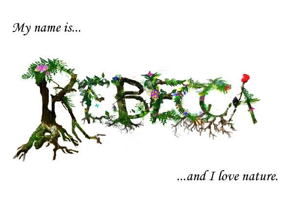
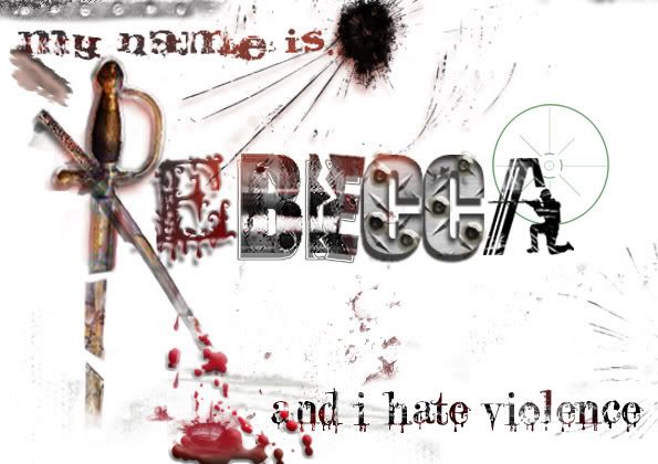
I tried to simplify the background so the font stands out. Then I had the problem of a missing file so my last edits have disappeared! So we have reverted back to the more bushy letterings with a few different edits but no waves and butterflies in the back.
I added some borders to save the whiteness. But it too didn't work out well.

So a plain white back it is.

My name is Rebecca & I hate violence.
As foreseen, bringing in all the effects into the font would have been very disorienting. So I removed most of the background and enlarged the font as best I could. It involves a lot of layers for the colouring and and so on, overlaid, so it wasn't easy but it came out okay. Not the hugest font but readable.

No comments:
Post a Comment