Making sure to use original images, I created several designs and let the class choose what they liked best.
B-Bop:
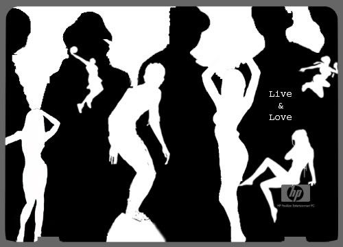
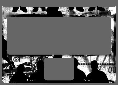
A contemporary representation of life, focusing mostly on youth. I liked the concept of silhoutte to create silhoutte through inlaying. It's representative of how life is fluid and lives are always overlapping. It's meant to look very alive but not loud, so I stuck with black and white.
"Live. Love." was meant to communicate like the image, very simply and open to interpretation. It packs a punch in being very brief. Sometimes simple words represent the most complex ideas because they spell out nothing.
Nymphelica:
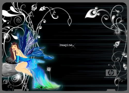
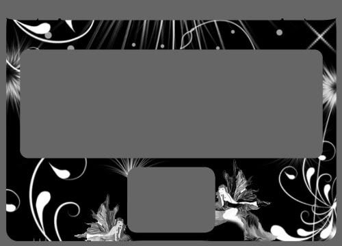
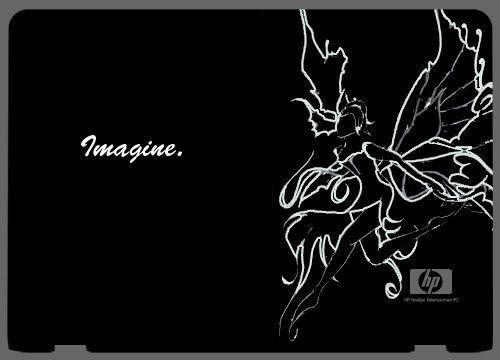
Seems familiar? I drew this fairy from scratch in Photoshop, inspired by Meilin Wong's art. I put it on a black background, envisioning what I'd like to have on my laptop. I complemented the image with all the swirls done with Photoshop paintbrushes, to bring the whole fairyfied feel to the laptop. I left the middle pretty blank because this is about imagination, so there needs to be space for the viewer to imagine and fill in the spaces themselves.
I think when we ask people to imagine, their mind races with a whole array of thoughts that even they can't understand. And it's unique to everyone. I thought it was a good concept and also in line with HP's tagline. I figured they'd like it too.
On the inside I took out the colour to make it more basic and used the options available in Photoshop when saving a RGB file to changed the greyed tones of the fairy. It really makes her look different. A bit more edgy, a bit more evil, a bit more angellic... all with this simple adjustment of the same colours. Again, it encouraged different ways of seeing the same thing -- imagining!
Kids:
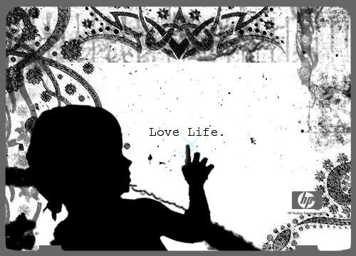
I was trying hard to think of something that really resonates life. Children of course are a strong image here. I employed the same theme in the tagline but the image of a child is enough to change it so that it now also looks like its an anti-abortion message.
Or it could just say love children. Love family.
The image I choose of my baby cousin with her finger out, also transforms the line to become one that encourages curiosity. And life is so much about that.
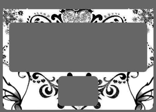
I wanted the interior just to be a neat design so I didn't put the image of the baby again. However the class feedback said it would be cool so I might work on doing that.
The colours are meant to be simple and uncomplicated. Also allows for the silhoutte effect and no particular identification to a specific baby but just an image of a baby. I did put a little blue colour where her finger looks like it's touching the words, just to add that little sparkle and positivity.
Bellowing Bella:
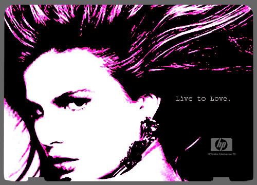
Life is about flowing and I love the way her hair looks in this picture so I thought a simple image with tweaked colours would be cool. Plus she has this strong stare that seems to say she's in control but engages people at the same time.
But I left it at that because no one really wants a face on their laptop.
A Ra-Ra Life:
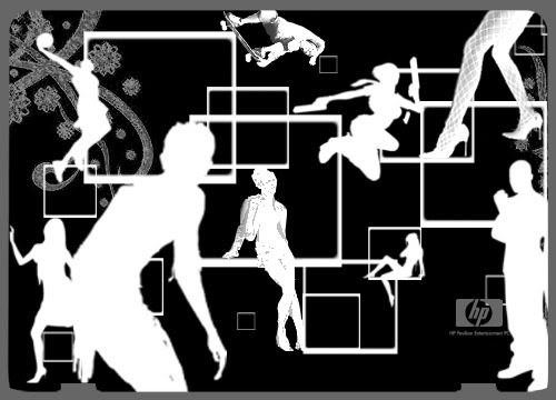
Another one I abandoned because it got way too noisy. There was no focus and just looked so messy. There wasn't much a way to neaten it.
Hairy Fairy:
This was a weak attempt at using contrast and the image I didn't use in the final version of the other assignment. Needless to say it looked horrible!
No comments:
Post a Comment