Sunday, September 30, 2007

Class Assignment 2: Moment - Final.


This is a 'come hither' moment. I think the simple gesture can represent many things depending on who is viewing it and the state one is in when viewing in.

For instance, it can be a gesture of openness. A sense of need, a weak plea for help.

Or it could be an effortless beckoning to another individual. So it is rather powerful.

It could be the elegance of a lady in dance.

There are many more possible meanings I feel, but it definitely looks like a motion in the middle of something. So I think it represents a real moment.

Sunday, September 16, 2007

Class Assignment 2: Moment


Incomplete. The moment is of books dropping.
My other idea is a close-up of eyes looking sideways, possibly out the window. I figure that image will be a little more cryptic, doesn't spell out the whole picture.


Saturday, September 15, 2007

Needful Things: Developments 3 + Final

I've been working on the previous idea and had trouble switching between mediums for editing. I tried out a different fairy, based on my favourite piece from Meilin Wong.


It was easier to work on and I've finally finished this piece.


Here, I switched the leg positions to make it simpler.


Found this one over-simplified. So I changed the wing shape and got the final (next pic).

FINAL:

Needful Things: Developments #2

Using 3 different fairy images & some of my own ideas, I drew a fairy with complex wings. I really liked the look of the fairy and I was starting from very complex and working my way down to simplicity. I figured there would be alot of removable elements.


This is how it looked.


I had trouble switching between mediums though. This was hand-drawn, then darkened with a pen. I took a picture of it and planned to edit in photoshop. The edges still weren't clear enough so after a few tries I scanned it in. That was better but still terribly difficult to edit, considering the specific edges and minute lines.


The paintbucket tool wasn't cooperating with the lines so I had to do extra editing to fill in colours.


I inverted the colours to see if that would help.


It was starting to look good but I couldn't see how it would look good simplified...


I spent a long time on it then decided it was too difficult as I was having to print the image out and edit and put it back in the computer for more editing. It also looked terrible when simplified because of the overlaps in the complex image, like the fold in the cloth and one leg over the other... So I decided to find another image to work on.


Needful Things: Developments I

I decided to switch to fairies for this assignment.
I like fairies alot and there's a particular photoshop artist (of whom I'm a fan) who creates amazing photoshop images of fairies. Without having these in hand, I drew a fairy offhand to see if I could create a recognisable symbol without details.
Convinced that it would fit the assignment, I tried to sketch more whimsical wings.
I excitedly looked up the artist's work and got started. I combined different elements I liked from 3 pictures to create an intricate image (ok I was having a lot of fun doing and just kept going) and will begin simplifying from there.


- I selected this fairy image because the posture communicates the fairy idea,
even if all the details are taken out.
Below u see how I incorporated this figure with wings from other images and some adaptation.

This is the final image from which I will be simplifying to create the symbol.

I'm not sure if I will continue drawing or to use photoshop, as it's easier for replication.

I'm excited to see how it turns out!

Needful Things

Since the lovely stomach flu found its way into my stomach, I was a little behind and so made some very quick doodles, trying to see if they could be simplified into recognisable symbols. I picked basketball to present in class but didn't find this very interesting, although very manageable.


- Basketball
- Volleyball


- Nailpolish
- Light

Basketball: Progressively simpler. Done in photoshop.


- Final image: Problem with this is the similarity to netball.


This is the alternate idea for basketball.This is somewhere in between the spectrum of simplicity, but since I've decided to move away from basketball entirely, I won't be developing this further.


Me, Myself & I: Developments #3 + Finalized

My name is Rebecca & I love nature.


I tried to simplify the background so the font stands out. Then I had the problem of a missing file so my last edits have disappeared! So we have reverted back to the more bushy letterings with a few different edits but no waves and butterflies in the back.


I added some borders to save the whiteness. But it too didn't work out well.


So a plain white back it is.


My name is Rebecca & I hate violence.


As foreseen, bringing in all the effects into the font would have been very disorienting. So I removed most of the background and enlarged the font as best I could. It involves a lot of layers for the colouring and and so on, overlaid, so it wasn't easy but it came out okay. Not the hugest font but readable.


Me, Myself & I : Developments

After I photoshopped the pictures, I played around with several effects and especially with the background. It's still unfinished but the general idea is already established.

Instead of just placing the final picture presented in class, I've included my progression just working within photoshop.
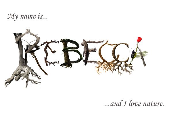


Love:

As my first piece, this took a lot of effort. I had to find multiple pictures of trees in the right shape and adjust the branches to form the lettering properly. Scouting, naturally, was difficult.
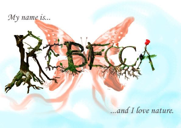
-After receiving input that the trees look too dead, I added more colour, and removed the inner part of the R as it seemed unnecessary and causing clutter.

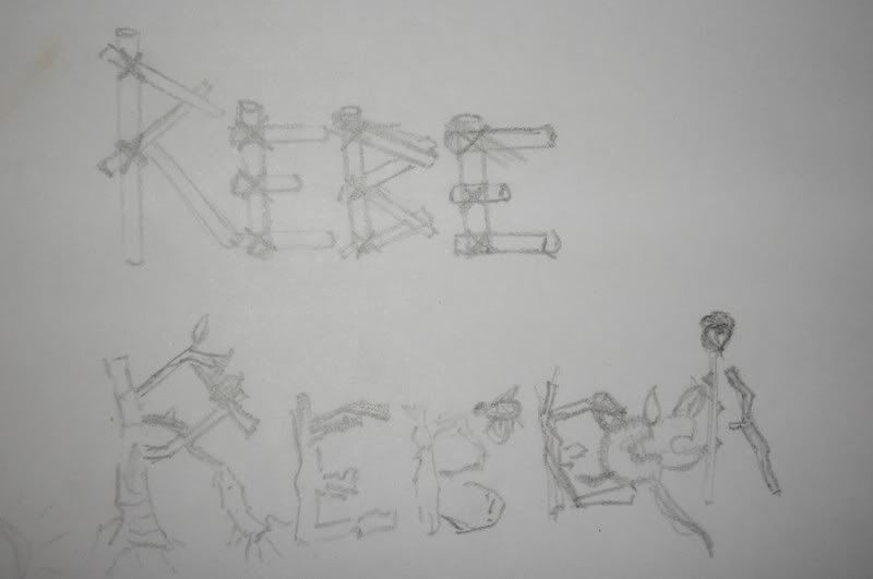
- This was a rough draft reflecting the original design, to give myself an idea of what next to work on and how it would look.
- For the next few I added more leaves and colour to give more life to it. I tried switching around the backdrop to add more natural elements aside from just trees/roots. But I also faced the problem of the background taking away the effect of the text as trees.
- I removed some of the leaves from the letters E and C as it looked a little too crowded.


- I plan to further correct the backdrop, possibly going back to the original idea of the butterfly and ribbons/waves, but probably only with soft outlines so it's light and not distracting. If that doesn't work, I'll likely leave it blank. (I just don't fancy empty white spaces!)


Hate:

I switched the lettering for R to a sword with a katana across it, as it was too difficult to decipher the lettering when I used rifles.

I experimented with several effects and found most of them wouldn't fit in the font because the letter R was particularly small and looked ugly enlarged.


The 'E' didn't seem to fit with the other font so I edited it as you will see in the next picture. I liked the effect of the 2nd torn 'E' and realised that all the violent effects that I found couldn't be fit into the text itself because it took away the uniformity and the metallic effect of the text.


I had 2 problems with the letter 'R'. When the sword was in full length, it distorted the effect of looking like R. When shortened, it didn't look like a sword. So I fixed it here by breaking the length into shards so the main part is bolder to allow the 'R' effect to come through.

I also thought the 'A' being in the same format as 'B' and 'E' made too much of the text uniform, which in effect made the other letterings look out of place - like I just put it there because I could. So I changed it and was particularly pleased with the effect of a sniper stretching across a neat left half of the 'A'.

Aside from the text being a little too small, I was quite happy with the effect of this piece, but needed feedback as to whether there was too much going on in the background.
The tutorial group was quite divided on this. Some said the chaos perfectly reflected the idea, which was what I had in mind. But the others said it was a little distracting.

I plan to try to make the font larger and incorporate the effects into the text itself.
If this doesn't work, I will likely try to make the font slightly larger and take out some of the grey in the background but leave the effects there. I like how they make the idea of violence resonate throughout, making the entire paper an artpiece. "my name is" and "i hate violence" would be stranded otherwise.

I really like most of the effects of the bullets and glass smashing because of how it effectively conveys violence. But some of these would make the text unreadable and that defeats the purpose.

I have to find a way to bring the elements together.

Friday, September 14, 2007

Me, Myself & I


I chose to represent love and hate: love of nature, hate for violence.
Here are the classroom drafts for Love:


- Wooden logs tied together
- Branches and roots with some leaves, and a rose as the 'A'

- Square font with images of nature in it. Mountains, sun, trees, beaches, flowers etc.

- Waves within the lettering.

- Waves as the lettering.
- Waves as lettering, with flowers and surfboards as the gaps in lettering.


The 2 presented in tutorial:


-The final one chosen to be developed further.


Classroom drafts for Hate:


2 Presented in Tutorial:


-Chosen for further development