Saturday, October 27, 2007

A Very Hpy Experience

I tried to think of positive ideas and was encouraged by the abstract ideas I had for the poster before.

Making sure to use original images, I created several designs and let the class choose what they liked best.

B-Bop:


A contemporary representation of life, focusing mostly on youth. I liked the concept of silhoutte to create silhoutte through inlaying. It's representative of how life is fluid and lives are always overlapping. It's meant to look very alive but not loud, so I stuck with black and white.
"Live. Love." was meant to communicate like the image, very simply and open to interpretation. It packs a punch in being very brief. Sometimes simple words represent the most complex ideas because they spell out nothing.


Nymphelica:


Seems familiar? I drew this fairy from scratch in Photoshop, inspired by Meilin Wong's art. I put it on a black background, envisioning what I'd like to have on my laptop. I complemented the image with all the swirls done with Photoshop paintbrushes, to bring the whole fairyfied feel to the laptop. I left the middle pretty blank because this is about imagination, so there needs to be space for the viewer to imagine and fill in the spaces themselves.

I think when we ask people to imagine, their mind races with a whole array of thoughts that even they can't understand. And it's unique to everyone. I thought it was a good concept and also in line with HP's tagline. I figured they'd like it too.

On the inside I took out the colour to make it more basic and used the options available in Photoshop when saving a RGB file to changed the greyed tones of the fairy. It really makes her look different. A bit more edgy, a bit more evil, a bit more angellic... all with this simple adjustment of the same colours. Again, it encouraged different ways of seeing the same thing -- imagining!


Kids:


I was trying hard to think of something that really resonates life. Children of course are a strong image here. I employed the same theme in the tagline but the image of a child is enough to change it so that it now also looks like its an anti-abortion message.

Or it could just say love children. Love family.

The image I choose of my baby cousin with her finger out, also transforms the line to become one that encourages curiosity. And life is so much about that.

I wanted the interior just to be a neat design so I didn't put the image of the baby again. However the class feedback said it would be cool so I might work on doing that.

The colours are meant to be simple and uncomplicated. Also allows for the silhoutte effect and no particular identification to a specific baby but just an image of a baby. I did put a little blue colour where her finger looks like it's touching the words, just to add that little sparkle and positivity.


Bellowing Bella:


Life is about flowing and I love the way her hair looks in this picture so I thought a simple image with tweaked colours would be cool. Plus she has this strong stare that seems to say she's in control but engages people at the same time.

But I left it at that because no one really wants a face on their laptop.


A Ra-Ra Life:


Another one I abandoned because it got way too noisy. There was no focus and just looked so messy. There wasn't much a way to neaten it.

Hairy Fairy:

This was a weak attempt at using contrast and the image I didn't use in the final version of the other assignment. Needless to say it looked horrible!

Saturday, October 20, 2007

Save This/That: Developments + Finalized

The image was simple enough but I had a very hard time figuring out how to adjust the copy at the bottom.

The class gave their critiques asking that the punchline be made bigger because they found that particularly entertaining.

They also wanted larger font for the copy and couldn't tell that it was coloured and not black.

I moved the copy around. Made the following considerations:

Right-alignment: Imitated the alignment of the poster's visual.

Left-alignment: Balanced the alignment through mirroring.

Center-alignment: Tied the poster in neatly into the rectangular shape.

Straight font for punchline: Gave it a bit of a tongue-in-cheek serious feel.

Cursive font for punchline: Gave it that informal feel, in line with what it's saying. Also resonates that laidback kind of coolness.
Either way it's meant to tie back to the image and break the seriousness of the message before the audience walks away. This is just a way of getting the message to still stay there, but in a less direct route.


Green font: Just a dash of colour but doesn't break far away from the black. Same dark tone.

Dark blue font: Same idea but a little more eyecatching. It's meant to be a subtle difference from the black, to say that if your eyes are sharp enough, you will see the difference between black and blue. The benefit of protecting your eyes! Reinforces the poster's message. Again a bit of a wink. Would have been fun to put a line in, but I thought it'd be too cheesy. I can just hope there's a bunch of people reading at one time and one friend can point out to another the difference and they can have a laugh about being colour blind or really needing to heed the poster's advice.


Bright blue font: Would be quite an in-your-face difference to the black and white image above and the message would get through. But it breaks the harmony of the poster as one uniform image.

Black font: No subtle messages but the poster looks well put together, keeping to the timeless black & white scheme.


It took a lot of printing with the Central Library's less-than-perfect printers which made every coloured ink look the same except for the green, to decide that this was the best choice.


I also realised it was very pixelated so I vectorised it and it looks better now.

Save This/That


This was a fun assignment to experiment with. I brainstormed on what to 'save' and wanted to do something no one else would do. So no saving trees and water for me.

I thought of how this is a design module and immediatly thought of doing something abstract and artistic in concept.

Since I abandoned the fairy in the last assignment, I thought I'd use it here instead. You can probably tell I really like fairies. There is still that bit of magic in them that you can't erase and its so funny that everyone knows what they are even though they aren't real. They are less laughable than unicorns.

I thought it complemented the abstract idea well.

So I developed the line "Save the Art of Imagination".

Why? Because now the world is so much about being realistic, money-making and practical. We are asked to stop dreaming if we pursue anything artistic and emotive. I think childhood is being taken away from children. And even as adults we repress our more carefree being. It was also a line in defence of the Arts. It was meant to say, dare to dream, don't be afraid to be happy in idyllic and cheery thoughts.

So I tried different ways of representing a fairy. That is where they exist anyway - in our imagination.

A fairy depressed at the state of our imagination today.
(The colours are awful but this was a trial stage so I was testing all the bright colours to see what would work best. They weren't supposed to all be on the same paper for the final design)


A fairy gleeful - representing what we should save.


More conceptual and less encompassing. I liked how this turned out. The middle portion controlled the attention by using thicker lines and lightened as it broadened out where text was supposed to be the main focus. It also represented going outside the lines in non-linear shapes. Not in a box. I liked the look of this. I would have developed this but the class chose the other poster I presented.


The other abstract idea I had was "Save the Curves."

I liked the challenge of presenting something that resided more in our minds. Curves are of course visually apparent but this line was so much to do with perception and meanings rather than just curves.

It represents a dual meaning. One is similar to the idea above. Curves in the sense of thinking in non-linear ways. Doing things that a little more fluid and creative. Things that are unplanned and ingenius.

The other idea is to do with encouraging girls to love their bodies and all the curves on it. This is quite in line with the new statements being made at Milan where skinny models are being banned from the runways.

What I wanted to depict here is a square box on the left with a fancy design of just different lines and rectangles on a coloured background. I've experimented with this before and it looked nice so I wanted to re-explore it.

Here's the design I did previously.


On the opposing side I wanted to place women or outlines of women with alot of curves. They would be sensual positions and highlighting the natural shapes of the body. By curves I don't necessarily mean overweight women. There are alot of women in-between who feel stuck - can't pity them for being fat, can't love them for being skinny. I think alot of women are healthy in this state but made to feel like they have to be thin to be beautiful. So my designs weren't about very rounded women but just curvy. They would interact with the lines in a different way also, not just as borders to box an image. Legs would cross over and backs lean on it like a wall etc.

I didn't get to even do the draft very well but i had it envisioned in my mind quite well.


The last idea I had was very basic. I wasn't enthusiastic about this one but I figured I should show up in class with one fully developed idea. I did, using a simple black-and-white format and an image of a friend I have who looks very much like a rockstar in shades. I worked the copy around it and tried to form a directional flow just to control the eye.

Big bold font spoke the message up above and the brief information was included at the bottom only for passers-by who were intrigued by the poster. The font therefore didn't need to be huge. I wanted it to be quite casual as well because people generally don't take this matter seriously so I didn't want it to be by-passed entirely for looking like a ridiculously serious health-ministry poster or something official like that.

The tagline at the bottom was meant to be a punchline for those who bothered to come forward to read the copy so they walk away with a smile and a positive feel to allow the poster's message to be remembered and taken in a good light.

Thursday, October 11, 2007

U C What I C: Version 1


"Telling a story with not more than 10 pictures"

I didn't have enough volunteers for characters so I employed my obliging dolls to star in my film.


In the first story, I wanted to use a little bit of the 'Gilligan's Island' idea and have the evil dolls attack me. Unfortunately, I needed my parents' help but they were in a bit of a hurry so it didn't come out great. For instance, the last wide shot of the character lying dead, sprawled across the staircase landing is absent.

Also it had to star myself quite unfortunately. I will include the intended meanings of the photographs.

Girl walking comfortably at home. Clock meant to be noticeable.

She trips over a barely-visible wire. This should seem strange.

She is sprawled across the landing, unconscious.


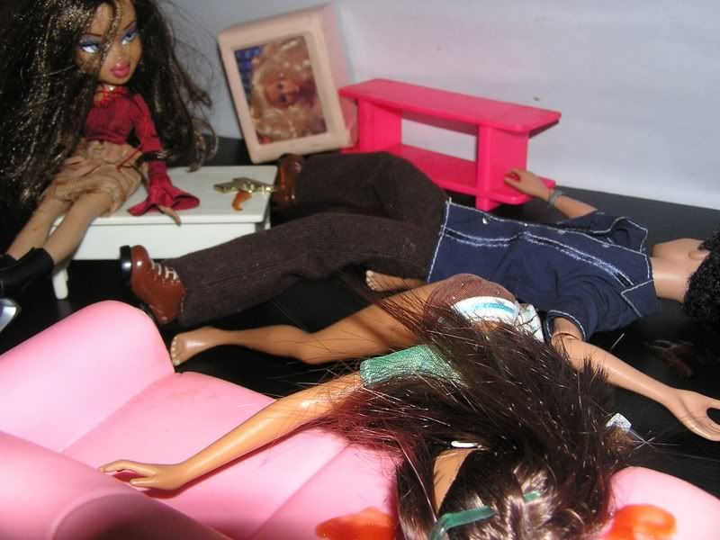
She comes to. (Clock meant to be visible. Passage of time becomes evident. She has been out for quite some time. What has happened in that time?)


She opens her eyes, in the awkward position after her fall, and is shocked to see dolls lined up in front of her. She connects this to the wire that seemed to hint of foulplay. It was the dolls! They seem alive!

Note: She is tied up.

The dolls tie her down and she screams, terrified.

She passes out again. (Fear, shock etc.)

Suddenly the dolls seem tiny. Someone is picking them up.

The camera zooms out and we see someone from the household laughing hysterically, dolls-in-hand. It was meant to show that the dolls weren't actually alive. They were manipulated by someone (with a little batteries and imagination you can figure out how) to commit the acts. This character is thrilled that the girl fell for it.

The 'Home Sweet Home' was meant to be somewhat in view to suggest it wasn't a threatening thing.

I actually had several different ideas for this one. It was meant to end with a shot of the girl just sprawled out, no additional character added. This would suggest the dolls had won. (Assumption: they were evil dolls that really were alive).

Alternatively, the character at the end was supposed to have an evil laugh as if he were the puppet master having victoriously killed the girl.

U C What I C: Version 2


Tuesday, October 9, 2007

U C What I C: Drafts & Planning

Examples of layout drafts for the storybook.


Layout being edited.


Layout further edited.

Elements being added.


Flaws in pictures after being coloured in. Problem here was the transfer from flash to other programmes, hidden layers were showing up. Shifting between programmes we edited to remove the unwanted parts.


Before being coloured.


Before text was added.


Planning for the photographic story. As you can see some were abandoned halfway due to foreseen difficulties in accurate portrayal.


The stories changed according to what I could make the characters do and new ideas emerging in production process.

Eventually I decided to go with the brutal doll story because it was fun and interesting, involving many different angles to get the right visuals. It was fun to play around with elements like colours.

Unfortunately I didn't manage to edit the backdrops more dramatically but the composition idea of each photograph is still quite evident.


I deliberately shot this version allowing for open interpretation at one point. It can be seen as a horror story of a girl coming back to life. The reddenned image of her face seems to communicate this. This was done simply by placing my finger over the flash bulb.

The other interpretation is just that she didn't die and come back for revenge.

I like that it is open, allowing different people to interpret differently or some people to even intepret both and toggle back and forth to wonder which one. Sometimes art doesn't have the answers, so I was quite happy with the ambiguity formed by using my creative license.

Drafts.


Drafts.


Drafts.