Thursday, November 22, 2007

Class Assignment 3: 'Interesting' & 'Capture'

Representations of the words, done with Edeline.


Interesting: When something interests you, you look closely. So we chose a magnifying glass.


Capture: A cage for physical capture. A camera to capure the moment.


Thursday, November 8, 2007

A Fairytale Ending: The End

Some images of the pages, before and after text was added.


Wednesday, November 7, 2007

A Fairytale Ending: Part 3

Images were drawn using a Wacom tablet and Flash. It was later coloured in using Corel Painter.


Tuesday, November 6, 2007

A Fairytale Ending: Part 2

Planned out the page layouts of where graphical elements would lie and how text would wrap around it. We wanted each page to look different to keep the stimulus of our child readers alert, to maintain their attention and keep them interested. The consistency of text size and kinds of images was to keep them reading through but the adjusted text helped to draw them into a new exciting page each time.


Monday, November 5, 2007

A Fairytale Ending: Part 1

Frederique, Sri & I got together and came up with several stories.

1) Brainstorming & story generation

This phase was aimed at coming up with ideas about a storyline suitable for the target group (6-9 year olds) and considering different design options. We wanted the following elements to be present in our story:

- A little boy
- A moral
- An adventure
- Storyline not too childish
- Drawings on all pages
- Text organized in different ways: around pictures, next to pictures, under pictures etc.

We came up with several ideas:
a) A boy in an upside down world
b) Following the life of a coin
c) Time machines


We left those and developed two storylines to present in class. These are:

(Untitled)
A little boy has a fight with his parents. Upset, he decides to sneak into his father’s chemistry laboratory where he is not allowed to go and has never been in. He drinks a chemical potion. He becomes invisible, and realises that he can do anything he wants. He visits the people he does not like, and plays tricks on them by changing little things in their house (like in the film Amélie). He ties shoelaces together, switches toothpaste for something else, glues people to their seats, moves things about. Then, he goes to house of the school’s biggest bully. Obviously he doesn’t favour this boy. While planning to execute a trick on him, the little boy realises that the school bully is actually bullied at home by his father. The bully is sad all the time too. The little boy sees things in a new light and feels guilty. He decides to undo all the nasty things he has done. However, he is becoming visible again, so in order to not be seen he has to race against the clock. He is back in bed just in time, and pretends to be asleep as his mother comes in to wake him up.

Jason and the World of Plastic Trees (original idea)
A little boy, who is always rude to plants and trees (kicks them, plucks the leaves) one day gets sucked into a tree (or other secret passage) and ends up in a world full of plastic trees. These trees are sad and mean and rude to him. In this world, there is one last real tree, with leaves, a bark and a natural smell. People have to pay to see this last tree (inspired by the song Big Yellow Taxi from the Counting Crows). Saddenned by the mean words of the tress and feeling in despair, Jason sits at the foot of a tree. There he sees an old man stroking a leaf and mumbling something that catches Jason’s interest. Jason talks to this wise old man who then tells him about how the world used to be when there were still living trees and how sad people are these days. He tells Jason why trees are important and how to take care of them. Then Jason goes back to the other world and makes a change for the better. He is now gentle with nature, takes care of the trees around his home and teaches other people about it as well.

We considered the option of making the old man the future version of Jason (he meets his older self), but reckoned that this would be a bit too complicated for 6-9 year olds.


These two ideas we proposed to our tutorial group, who liked Jason and the World of Plastic Trees best. In this tutorial session we also decided to leave out the ‘rudeness to plants’, as not many children are particularly rude to plants and trees, and including it in the story could hinder the process of identification/empathy.


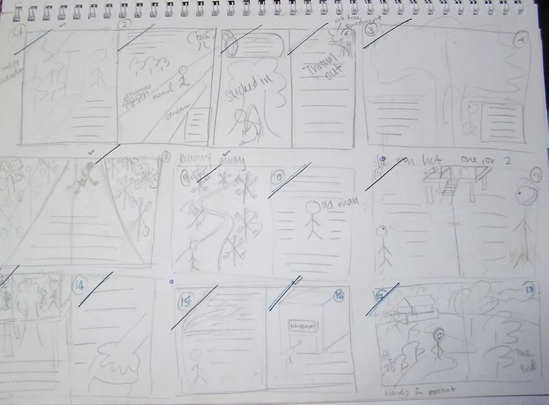
1b) The Story : Outline
- Introduction of Jason
- Walk through the forest
- Sucked into the tree
- Description of Plastic Tree world
- Talking trees
- Introduction of old man
- Old man’s story - moral
- Back in real world
- Conclusion


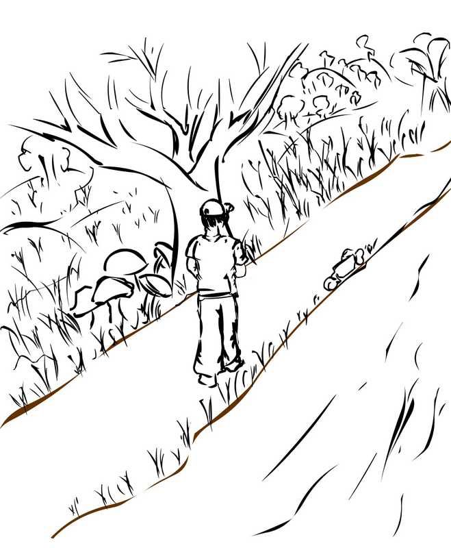
Once upon a time, there was a boy called Jason. Jason was a boy like every other boy: brown eyes, black hair, the newest sports shoes and a red baseball cap. Jason lived with his parents in a little house near a big forest, in which he often went for a walk and never got lost. The forest was called the Never Ending Forest, because it was so large. Jason knew the paths by heart, because he remembered all the small things along the way: the mushrooms that formed a circle, the little stream rushing by, the tree in which the nightingale hid.

One misty Tuesday, when Jason got home from school, he went for a walk in the forest. He had put on a woollen scarf and his blue coat, and stuck his hands in his pocket to stay warm. He walked fast, he knew his way despite the thick mist that surrounded him.

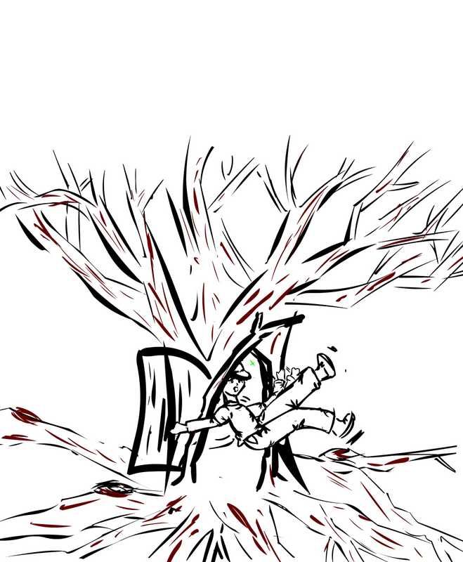
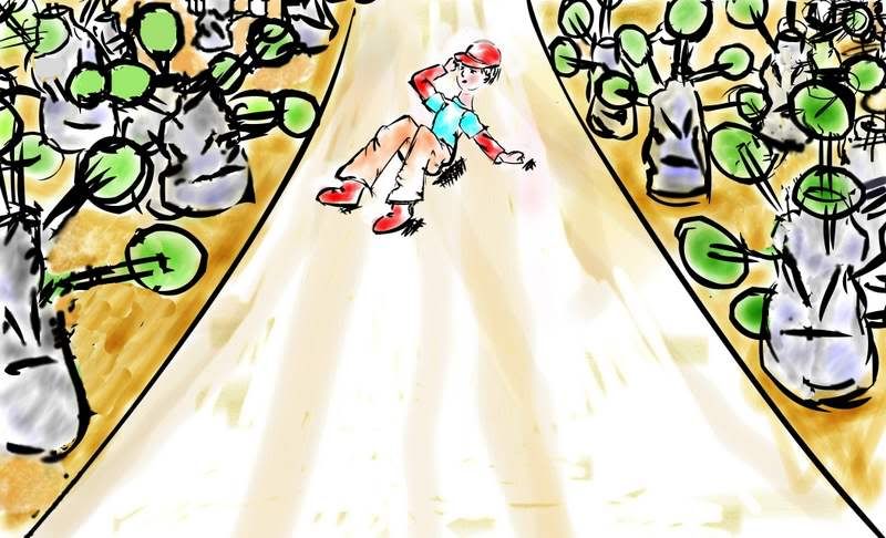
Suddenly he stopped; something strange had caught his eye. The large, old oak tree, which he called the Nightingale-tree, somehow seemed to look different. On the thick, wrinkled bark, there was a crack that had never been there before. Jason walked up to the tree to look closer: there were more cracks, and together they formed a door. Then, when he touched the bark, the door flew open and Jason was lifted off his feet and sucked into the tree. A flashing green light surrounded him, and after what seemed to be only a fraction of a second, he was smashed to the ground.

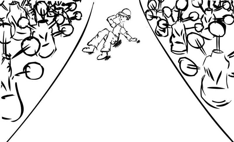
Jason opened his eyes and shook his head: he felt dizzy. When he looked around he couldn’t believe his eyes. He was still in the Never Ending Forest, but all the trees that used to be so beautiful, green and alive were now made of plastic. They looked like toys, but about a hundred times bigger than the ones Jason played with at home.

Not knowing where he was, he got to his feet and began to walk. Every single tree had turned plastic and Jason carefully touched a young pine tree. “Ouch!” he screamed, when the hard plastic leaves hurt his fingers. He stuck his nose closer to the tree, and was shocked to smell plastic instead of the wonderful smell that always reminded him of Christmas.

Jason was scared and walked away. When he passed a big, shiny tree, he suddenly heard a low laughter. He looked over his shoulder to see if there was anybody around, but the path was deserted. “Stupid humans” the low voice murmured, “see what you have done”. Jason started running, but more and more voices started to speak to him. Some low, others high, some old, some young, but all in the same sad and angry tone. “Look what has become of us”, “How do you like us now, huh?”.

The little boy looked around and around, his red cheeks turned pale. He seemed to be all alone; it were the trees that were talking to him! He ran and ran until – boom! – he hit something. Jason first screamed, and then felt ultimately relieved when the thing he had bumped into turned out to be an old man. Another human being! Made from flesh and blood, not plastic. The old man had a long, white beard and friendly eyes as blue as the sky. He smiled generously at Jason. “Come boy, let me show you something”. He led him to plastic hut surrounded by tall, plastic trees. Pink, plastic flowers surrounded the entrance. Next to it was a black box. “You’re lucky boy, people normally have to pay to enter, but I’ll show you around for free”.

Together they climbed into the hut. It was nicely warm inside, but dark – Jason could hardly see where he had ended up. A bright light in the distance caught his eye, and the old man guided him towards it. “This is the last one, Jason”, he said in a sad voice. In the light, Jason saw a real, living tree. Its green leaves rustled in the wind and he could smell the freshness of the wood. The man started his story: “A long time ago, all trees looked and smelled like this one. The earth was green and fertile, and trees and plants provided oxygen and natural beauty for humans and animals. But mankind was careless and selfish, and killed all trees to make space for high buildings and modern cities. They used the wood to make newspapers, comics and a thousand other things.” Jason listened silently. “Now all trees are plastic, oxygen comes from another planet and books don’t exist anymore. This tree is the very last one, and it’s dying. Soon, living plants and trees will be extinct.” The little boy’s eyes grew big. “I’m an old man Jason, you are still young. Please go back and tell the people to take care of the trees”.
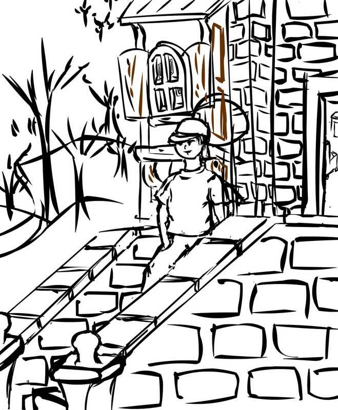
The wrinkled hand touched his red baseball cap, and Jason got spiralled back through the green light, into the real world. He was back again in the Never Ending Forest, full of living trees. He smiled and marched straight to the biggest newspaper’s headquarters, to tell his story to the rest of the world. Do you think they believed him? Let me tell you: it was on the front page the next morning.

Sunday, November 4, 2007

Fairytale trials

Testing out leaf shapes and how to draw a metallic tree. We decided in the end to remove metallic trees altogether from the story (required editing the story and the layout) to be consistent with the title. It also didn't seem to hinder the story flow.


First draft of how the plastic trees would look. Wanted the bends and folds to form a face. We chose plastic bottles (also recommended by the class) to be the tree bark because it was the most obvious and familiar form of plastic to kids. The greyish tones were used to represent translucence.

Saturday, October 27, 2007

A Very Hpy Experience

I tried to think of positive ideas and was encouraged by the abstract ideas I had for the poster before.

Making sure to use original images, I created several designs and let the class choose what they liked best.

B-Bop:


A contemporary representation of life, focusing mostly on youth. I liked the concept of silhoutte to create silhoutte through inlaying. It's representative of how life is fluid and lives are always overlapping. It's meant to look very alive but not loud, so I stuck with black and white.
"Live. Love." was meant to communicate like the image, very simply and open to interpretation. It packs a punch in being very brief. Sometimes simple words represent the most complex ideas because they spell out nothing.


Nymphelica:


Seems familiar? I drew this fairy from scratch in Photoshop, inspired by Meilin Wong's art. I put it on a black background, envisioning what I'd like to have on my laptop. I complemented the image with all the swirls done with Photoshop paintbrushes, to bring the whole fairyfied feel to the laptop. I left the middle pretty blank because this is about imagination, so there needs to be space for the viewer to imagine and fill in the spaces themselves.

I think when we ask people to imagine, their mind races with a whole array of thoughts that even they can't understand. And it's unique to everyone. I thought it was a good concept and also in line with HP's tagline. I figured they'd like it too.

On the inside I took out the colour to make it more basic and used the options available in Photoshop when saving a RGB file to changed the greyed tones of the fairy. It really makes her look different. A bit more edgy, a bit more evil, a bit more angellic... all with this simple adjustment of the same colours. Again, it encouraged different ways of seeing the same thing -- imagining!


Kids:


I was trying hard to think of something that really resonates life. Children of course are a strong image here. I employed the same theme in the tagline but the image of a child is enough to change it so that it now also looks like its an anti-abortion message.

Or it could just say love children. Love family.

The image I choose of my baby cousin with her finger out, also transforms the line to become one that encourages curiosity. And life is so much about that.

I wanted the interior just to be a neat design so I didn't put the image of the baby again. However the class feedback said it would be cool so I might work on doing that.

The colours are meant to be simple and uncomplicated. Also allows for the silhoutte effect and no particular identification to a specific baby but just an image of a baby. I did put a little blue colour where her finger looks like it's touching the words, just to add that little sparkle and positivity.


Bellowing Bella:


Life is about flowing and I love the way her hair looks in this picture so I thought a simple image with tweaked colours would be cool. Plus she has this strong stare that seems to say she's in control but engages people at the same time.

But I left it at that because no one really wants a face on their laptop.


A Ra-Ra Life:


Another one I abandoned because it got way too noisy. There was no focus and just looked so messy. There wasn't much a way to neaten it.

Hairy Fairy:

This was a weak attempt at using contrast and the image I didn't use in the final version of the other assignment. Needless to say it looked horrible!

Saturday, October 20, 2007

Save This/That: Developments + Finalized

The image was simple enough but I had a very hard time figuring out how to adjust the copy at the bottom.

The class gave their critiques asking that the punchline be made bigger because they found that particularly entertaining.

They also wanted larger font for the copy and couldn't tell that it was coloured and not black.

I moved the copy around. Made the following considerations:

Right-alignment: Imitated the alignment of the poster's visual.

Left-alignment: Balanced the alignment through mirroring.

Center-alignment: Tied the poster in neatly into the rectangular shape.

Straight font for punchline: Gave it a bit of a tongue-in-cheek serious feel.

Cursive font for punchline: Gave it that informal feel, in line with what it's saying. Also resonates that laidback kind of coolness.
Either way it's meant to tie back to the image and break the seriousness of the message before the audience walks away. This is just a way of getting the message to still stay there, but in a less direct route.


Green font: Just a dash of colour but doesn't break far away from the black. Same dark tone.

Dark blue font: Same idea but a little more eyecatching. It's meant to be a subtle difference from the black, to say that if your eyes are sharp enough, you will see the difference between black and blue. The benefit of protecting your eyes! Reinforces the poster's message. Again a bit of a wink. Would have been fun to put a line in, but I thought it'd be too cheesy. I can just hope there's a bunch of people reading at one time and one friend can point out to another the difference and they can have a laugh about being colour blind or really needing to heed the poster's advice.


Bright blue font: Would be quite an in-your-face difference to the black and white image above and the message would get through. But it breaks the harmony of the poster as one uniform image.

Black font: No subtle messages but the poster looks well put together, keeping to the timeless black & white scheme.


It took a lot of printing with the Central Library's less-than-perfect printers which made every coloured ink look the same except for the green, to decide that this was the best choice.


I also realised it was very pixelated so I vectorised it and it looks better now.

Save This/That


This was a fun assignment to experiment with. I brainstormed on what to 'save' and wanted to do something no one else would do. So no saving trees and water for me.

I thought of how this is a design module and immediatly thought of doing something abstract and artistic in concept.

Since I abandoned the fairy in the last assignment, I thought I'd use it here instead. You can probably tell I really like fairies. There is still that bit of magic in them that you can't erase and its so funny that everyone knows what they are even though they aren't real. They are less laughable than unicorns.

I thought it complemented the abstract idea well.

So I developed the line "Save the Art of Imagination".

Why? Because now the world is so much about being realistic, money-making and practical. We are asked to stop dreaming if we pursue anything artistic and emotive. I think childhood is being taken away from children. And even as adults we repress our more carefree being. It was also a line in defence of the Arts. It was meant to say, dare to dream, don't be afraid to be happy in idyllic and cheery thoughts.

So I tried different ways of representing a fairy. That is where they exist anyway - in our imagination.

A fairy depressed at the state of our imagination today.
(The colours are awful but this was a trial stage so I was testing all the bright colours to see what would work best. They weren't supposed to all be on the same paper for the final design)


A fairy gleeful - representing what we should save.


More conceptual and less encompassing. I liked how this turned out. The middle portion controlled the attention by using thicker lines and lightened as it broadened out where text was supposed to be the main focus. It also represented going outside the lines in non-linear shapes. Not in a box. I liked the look of this. I would have developed this but the class chose the other poster I presented.


The other abstract idea I had was "Save the Curves."

I liked the challenge of presenting something that resided more in our minds. Curves are of course visually apparent but this line was so much to do with perception and meanings rather than just curves.

It represents a dual meaning. One is similar to the idea above. Curves in the sense of thinking in non-linear ways. Doing things that a little more fluid and creative. Things that are unplanned and ingenius.

The other idea is to do with encouraging girls to love their bodies and all the curves on it. This is quite in line with the new statements being made at Milan where skinny models are being banned from the runways.

What I wanted to depict here is a square box on the left with a fancy design of just different lines and rectangles on a coloured background. I've experimented with this before and it looked nice so I wanted to re-explore it.

Here's the design I did previously.


On the opposing side I wanted to place women or outlines of women with alot of curves. They would be sensual positions and highlighting the natural shapes of the body. By curves I don't necessarily mean overweight women. There are alot of women in-between who feel stuck - can't pity them for being fat, can't love them for being skinny. I think alot of women are healthy in this state but made to feel like they have to be thin to be beautiful. So my designs weren't about very rounded women but just curvy. They would interact with the lines in a different way also, not just as borders to box an image. Legs would cross over and backs lean on it like a wall etc.

I didn't get to even do the draft very well but i had it envisioned in my mind quite well.


The last idea I had was very basic. I wasn't enthusiastic about this one but I figured I should show up in class with one fully developed idea. I did, using a simple black-and-white format and an image of a friend I have who looks very much like a rockstar in shades. I worked the copy around it and tried to form a directional flow just to control the eye.

Big bold font spoke the message up above and the brief information was included at the bottom only for passers-by who were intrigued by the poster. The font therefore didn't need to be huge. I wanted it to be quite casual as well because people generally don't take this matter seriously so I didn't want it to be by-passed entirely for looking like a ridiculously serious health-ministry poster or something official like that.

The tagline at the bottom was meant to be a punchline for those who bothered to come forward to read the copy so they walk away with a smile and a positive feel to allow the poster's message to be remembered and taken in a good light.

Thursday, October 11, 2007

U C What I C: Version 1


"Telling a story with not more than 10 pictures"

I didn't have enough volunteers for characters so I employed my obliging dolls to star in my film.


In the first story, I wanted to use a little bit of the 'Gilligan's Island' idea and have the evil dolls attack me. Unfortunately, I needed my parents' help but they were in a bit of a hurry so it didn't come out great. For instance, the last wide shot of the character lying dead, sprawled across the staircase landing is absent.

Also it had to star myself quite unfortunately. I will include the intended meanings of the photographs.

Girl walking comfortably at home. Clock meant to be noticeable.

She trips over a barely-visible wire. This should seem strange.

She is sprawled across the landing, unconscious.


She comes to. (Clock meant to be visible. Passage of time becomes evident. She has been out for quite some time. What has happened in that time?)


She opens her eyes, in the awkward position after her fall, and is shocked to see dolls lined up in front of her. She connects this to the wire that seemed to hint of foulplay. It was the dolls! They seem alive!

Note: She is tied up.

The dolls tie her down and she screams, terrified.

She passes out again. (Fear, shock etc.)

Suddenly the dolls seem tiny. Someone is picking them up.

The camera zooms out and we see someone from the household laughing hysterically, dolls-in-hand. It was meant to show that the dolls weren't actually alive. They were manipulated by someone (with a little batteries and imagination you can figure out how) to commit the acts. This character is thrilled that the girl fell for it.

The 'Home Sweet Home' was meant to be somewhat in view to suggest it wasn't a threatening thing.

I actually had several different ideas for this one. It was meant to end with a shot of the girl just sprawled out, no additional character added. This would suggest the dolls had won. (Assumption: they were evil dolls that really were alive).

Alternatively, the character at the end was supposed to have an evil laugh as if he were the puppet master having victoriously killed the girl.

U C What I C: Version 2


Tuesday, October 9, 2007

U C What I C: Drafts & Planning

Examples of layout drafts for the storybook.


Layout being edited.


Layout further edited.

Elements being added.


Flaws in pictures after being coloured in. Problem here was the transfer from flash to other programmes, hidden layers were showing up. Shifting between programmes we edited to remove the unwanted parts.


Before being coloured.


Before text was added.


Planning for the photographic story. As you can see some were abandoned halfway due to foreseen difficulties in accurate portrayal.


The stories changed according to what I could make the characters do and new ideas emerging in production process.

Eventually I decided to go with the brutal doll story because it was fun and interesting, involving many different angles to get the right visuals. It was fun to play around with elements like colours.

Unfortunately I didn't manage to edit the backdrops more dramatically but the composition idea of each photograph is still quite evident.


I deliberately shot this version allowing for open interpretation at one point. It can be seen as a horror story of a girl coming back to life. The reddenned image of her face seems to communicate this. This was done simply by placing my finger over the flash bulb.

The other interpretation is just that she didn't die and come back for revenge.

I like that it is open, allowing different people to interpret differently or some people to even intepret both and toggle back and forth to wonder which one. Sometimes art doesn't have the answers, so I was quite happy with the ambiguity formed by using my creative license.

Drafts.


Drafts.


Drafts.

Sunday, September 30, 2007

Class Assignment 2: Moment - Final.


This is a 'come hither' moment. I think the simple gesture can represent many things depending on who is viewing it and the state one is in when viewing in.

For instance, it can be a gesture of openness. A sense of need, a weak plea for help.

Or it could be an effortless beckoning to another individual. So it is rather powerful.

It could be the elegance of a lady in dance.

There are many more possible meanings I feel, but it definitely looks like a motion in the middle of something. So I think it represents a real moment.

Sunday, September 16, 2007

Class Assignment 2: Moment


Incomplete. The moment is of books dropping.
My other idea is a close-up of eyes looking sideways, possibly out the window. I figure that image will be a little more cryptic, doesn't spell out the whole picture.


Saturday, September 15, 2007

Needful Things: Developments 3 + Final

I've been working on the previous idea and had trouble switching between mediums for editing. I tried out a different fairy, based on my favourite piece from Meilin Wong.


It was easier to work on and I've finally finished this piece.


Here, I switched the leg positions to make it simpler.


Found this one over-simplified. So I changed the wing shape and got the final (next pic).

FINAL: