This was a fun assignment to experiment with. I brainstormed on what to 'save' and wanted to do something no one else would do. So no saving trees and water for me.
I thought of how this is a design module and immediatly thought of doing something abstract and artistic in concept.
Since I abandoned the fairy in the last assignment, I thought I'd use it here instead. You can probably tell I really like fairies. There is still that bit of magic in them that you can't erase and its so funny that everyone knows what they are even though they aren't real. They are less laughable than unicorns.
I thought it complemented the abstract idea well.
So I developed the line "Save the Art of Imagination".
Why? Because now the world is so much about being realistic, money-making and practical. We are asked to stop dreaming if we pursue anything artistic and emotive. I think childhood is being taken away from children. And even as adults we repress our more carefree being. It was also a line in defence of the Arts. It was meant to say, dare to dream, don't be afraid to be happy in idyllic and cheery thoughts.
So I tried different ways of representing a fairy. That is where they exist anyway - in our imagination.
A fairy depressed at the state of our imagination today.
(The colours are awful but this was a trial stage so I was testing all the bright colours to see what would work best. They weren't supposed to all be on the same paper for the final design)
A fairy gleeful - representing what we should save.
More conceptual and less encompassing. I liked how this turned out. The middle portion controlled the attention by using thicker lines and lightened as it broadened out where text was supposed to be the main focus. It also represented going outside the lines in non-linear shapes. Not in a box. I liked the look of this. I would have developed this but the class chose the other poster I presented.
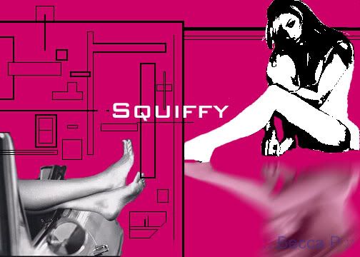
The other abstract idea I had was "Save the Curves."
I liked the challenge of presenting something that resided more in our minds. Curves are of course visually apparent but this line was so much to do with perception and meanings rather than just curves.
It represents a dual meaning. One is similar to the idea above. Curves in the sense of thinking in non-linear ways. Doing things that a little more fluid and creative. Things that are unplanned and ingenius.
The other idea is to do with encouraging girls to love their bodies and all the curves on it. This is quite in line with the new statements being made at Milan where skinny models are being banned from the runways.
What I wanted to depict here is a square box on the left with a fancy design of just different lines and rectangles on a coloured background. I've experimented with this before and it looked nice so I wanted to re-explore it.
Here's the design I did previously.

On the opposing side I wanted to place women or outlines of women with alot of curves. They would be sensual positions and highlighting the natural shapes of the body. By curves I don't necessarily mean overweight women. There are alot of women in-between who feel stuck - can't pity them for being fat, can't love them for being skinny. I think alot of women are healthy in this state but made to feel like they have to be thin to be beautiful. So my designs weren't about very rounded women but just curvy. They would interact with the lines in a different way also, not just as borders to box an image. Legs would cross over and backs lean on it like a wall etc.
I didn't get to even do the draft very well but i had it envisioned in my mind quite well.
The last idea I had was very basic. I wasn't enthusiastic about this one but I figured I should show up in class with one fully developed idea. I did, using a simple black-and-white format and an image of a friend I have who looks very much like a rockstar in shades. I worked the copy around it and tried to form a directional flow just to control the eye.
Big bold font spoke the message up above and the brief information was included at the bottom only for passers-by who were intrigued by the poster. The font therefore didn't need to be huge. I wanted it to be quite casual as well because people generally don't take this matter seriously so I didn't want it to be by-passed entirely for looking like a ridiculously serious health-ministry poster or something official like that.
The tagline at the bottom was meant to be a punchline for those who bothered to come forward to read the copy so they walk away with a smile and a positive feel to allow the poster's message to be remembered and taken in a good light.
No comments:
Post a Comment